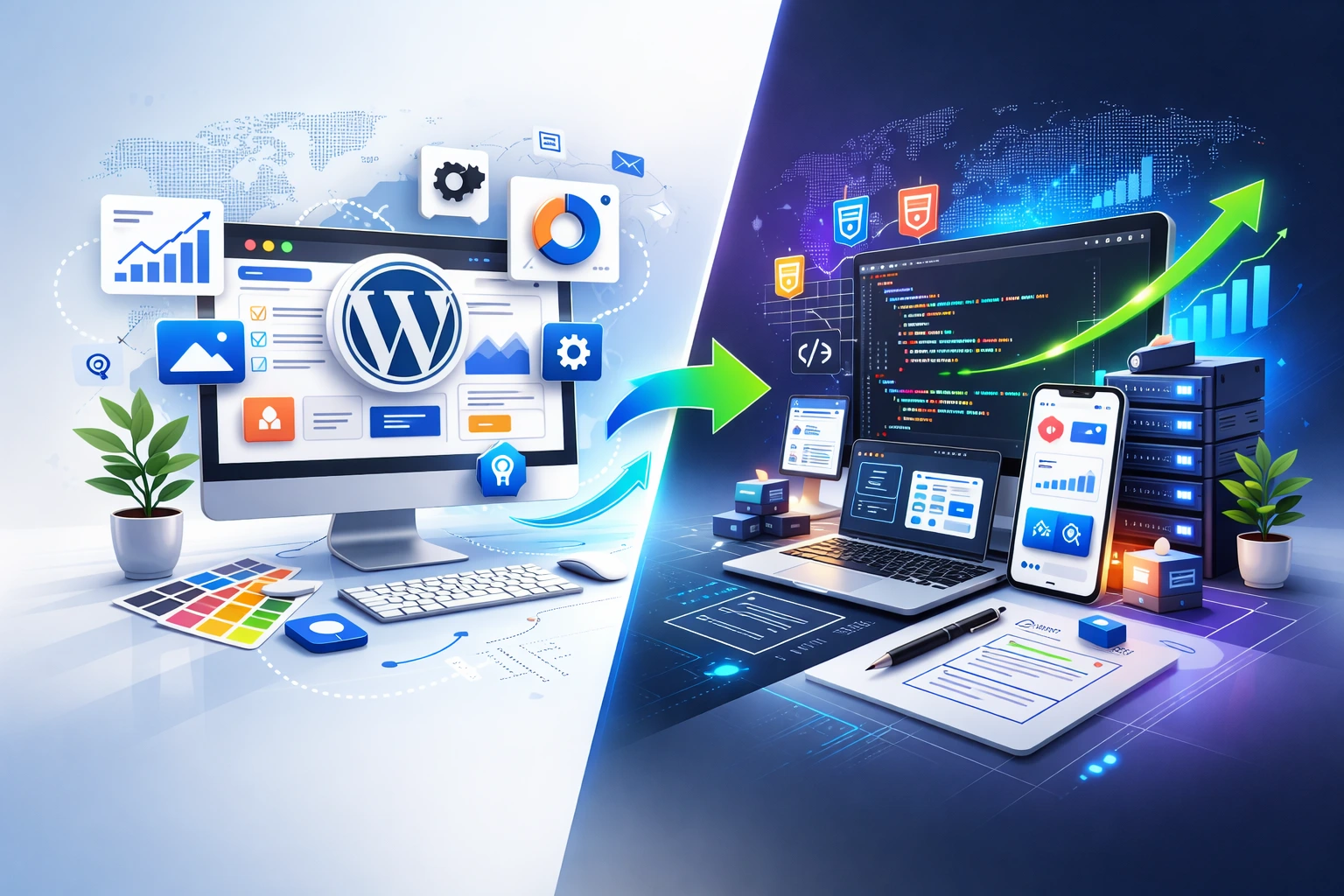
Introduction: Your Website Is Your Digital Sales Engine
In today’s digital-first world, your website is often the first interaction potential customers have with your business. Before they call you, visit your store, or send an inquiry, they check your website.
And here’s the truth:
A website is not just an online brochure. It’s a 24/7 sales machine.
A high-converting website works even when you’re sleeping. It answers questions, builds trust, captures leads, and moves visitors closer to buying.
But not all websites are built to convert.
Many businesses struggle with:
Low inquiries
High bounce rates
Poor engagement
Weak online credibility
The difference between an average website and a high-converting one lies in strategy, structure, and user experience.
Let’s break down exactly what makes a website convert visitors into customers.
First Impressions Matter More Than You Think
Visitors form an opinion about your website within just 3–5 seconds. If your site looks outdated, cluttered, slow, or confusing, most users will leave immediately—and rarely come back.
A strong first impression builds instant trust. It shows professionalism, establishes brand authority, reduces bounce rate, and encourages visitors to explore further. Most importantly, it increases the chances of conversion.
Your homepage should clearly communicate value the moment someone lands on it. The hero section must explain what you do, who you help, and what results you deliver. For example, “Helping Businesses Generate More Leads Through High-Converting Websites” is far more effective than a generic welcome message.
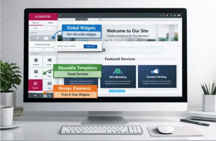
Clean, modern design plays a key role here. A minimal layout, consistent colors, professional typography, and high-quality visuals make your website feel credible and easy to use. A strong visual hierarchy—guiding users toward the headline, supporting text, and call-to-action—keeps visitors focused. When things are clear, users stay. And clarity converts.
Speed & Performance: The Silent Conversion Killer
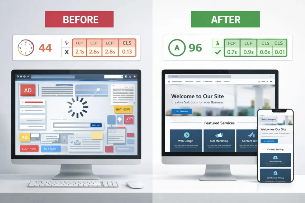
Website speed has a direct impact on user experience, SEO, conversions, and revenue. Research shows that when page load time increases from one to five seconds, the chance of users leaving jumps by nearly 90%.
Slow websites frustrate users, lower search rankings, reduce ad effectiveness, and make a brand look unprofessional. Speed builds trust. A fast website feels premium, while a slow one feels outdated.
Improving speed starts with optimizing images using compressed WebP formats and correct sizing. Reliable hosting, caching, and CDN usage help load pages faster. Cleaning up code by minifying CSS and JavaScript, removing unnecessary plugins, and avoiding heavy animations also makes a big difference.
Mobile-First Design Is No Longer Optional
More than 60% of website traffic now comes from mobile devices. If your site isn’t mobile-friendly, you’re losing potential customers every day.
Google uses mobile-first indexing, meaning your mobile experience directly affects your search rankings. A good mobile website loads quickly, is fully responsive, has readable text, large buttons, and easy thumb navigation.
Common mistakes like tiny text, slow images, crowded buttons, or intrusive popups create friction. A smooth mobile experience builds trust, keeps users engaged, and significantly improves conversions.
UX & Navigation: Simplicity Converts
User experience is about how easily visitors can find what they need and take action. When users feel confused, conversions drop.
A well-designed website uses clear structure, simple navigation, visible contact options, and short, scannable content. Forms should be easy, and pages should guide users naturally.
Your main menu doesn’t need to be complex. Simple options like Home, About, Services, Portfolio, Blog, and Contact are usually more than enough. Too many choices overwhelm users.
The goal is simplicity—because when your website is easy to use, people stay longer and take action.
Strong Call-to-Action (CTA) Placement
A good website doesn’t leave visitors guessing. Every page should clearly answer one simple question: “What should I do next?” Without clear calls-to-action, users may browse—but they won’t take action.
High-converting websites guide visitors using clear CTAs like Get a Free Consultation, Request a Quote, or Book a Strategy Call. These CTAs work best when placed where users naturally look—such as the hero section, after service descriptions, inside blog content, in the footer, or as a sticky button in the header.
Design also matters. A CTA should stand out using a contrasting color, be easy to spot, and use action-driven language. Avoid generic buttons like “Submit.” A clear CTA gives clear direction—and clear direction increases conversions.
Messaging That Focuses on the Customer
Many websites fail because they talk too much about themselves instead of their customers. Saying “We are the best company with 10 years of experience” doesn’t connect. What works better is explaining how you solve a problem and deliver results.
Your website messaging should focus on customer pain points, offer clear solutions, and highlight real outcomes. People don’t buy websites or services—they buy growth, results, and solutions. Speak about benefits and impact, not tools or features.
A Real-World Website Transformation
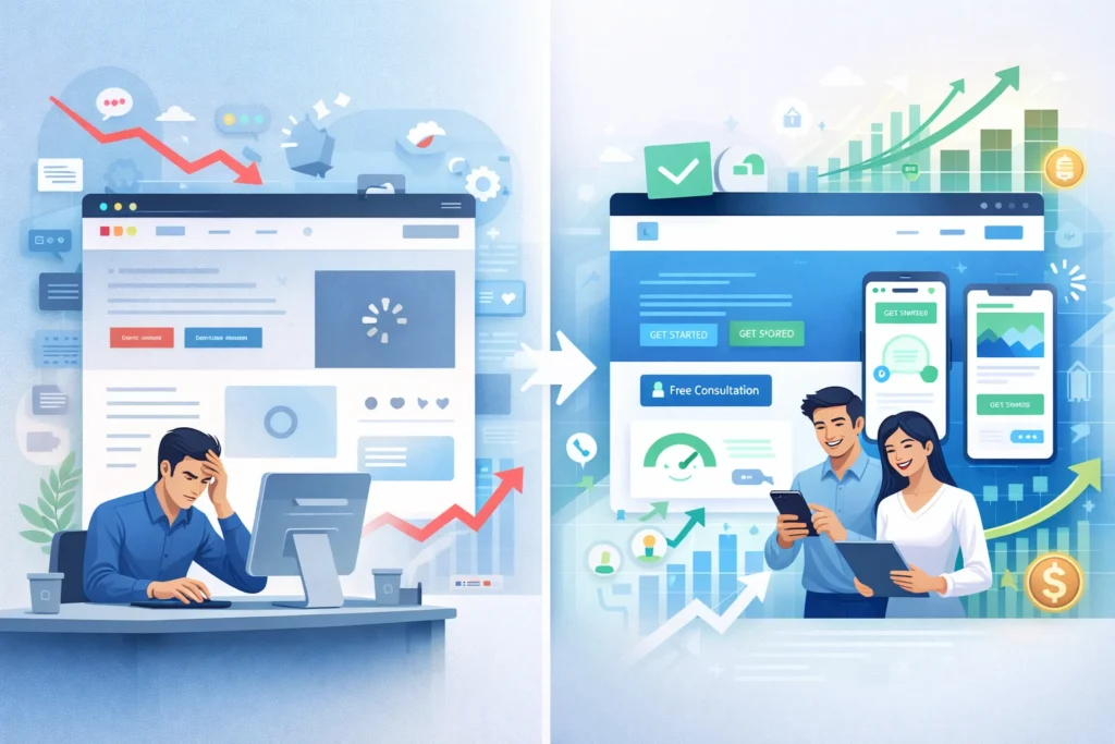
Consider a business with an outdated website that loaded slowly, wasn’t mobile-friendly, and had no clear CTA. The result was high bounce rates and very few inquiries.
After redesigning the site with a modern UI, faster load times, mobile-first structure, clear service pages, testimonials, and strategic CTAs, the results changed quickly. Within three months, bounce rates dropped significantly, traffic increased, inquiries doubled, and overall brand trust improved.
This proves one thing clearly: design, speed, and strategy together drive growth.
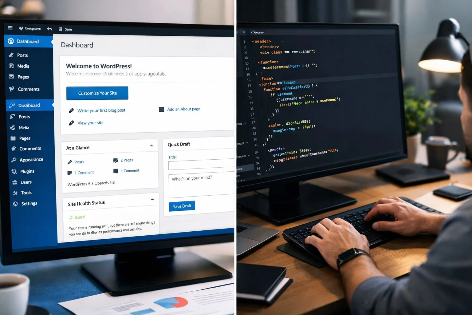
What Makes a High-Converting Website
A high-converting website works because all the right elements come together—clear messaging, professional branding, fast loading speed, mobile optimization, simple navigation, trust signals, strong CTAs, and a layout designed for conversions. When these elements align, your website becomes a powerful lead-generation engine.
Your Website Is a 24/7 Sales Machine
Unlike a physical store, your website works around the clock. It reaches people globally, educates visitors, builds trust, captures leads, and strengthens your authority—but only if it’s built strategically. Without strategy, it’s just an online brochure.
Final Thoughts
A beautiful website without strategy won’t convert, and a strategic website without good design won’t build trust. You need both.
In today’s competitive digital world, a high-converting website isn’t an expense—it’s a growth strategy. If your current website isn’t bringing consistent leads, it may be time to rethink how it’s built and positioned.
About the Author
This article was written by Harikrishnan J S, a Kerala-based Digital Marketing Expert specializing in SEO, AI-driven marketing, and conversion-focused websites & content strategy.